UI/UX Case Study:
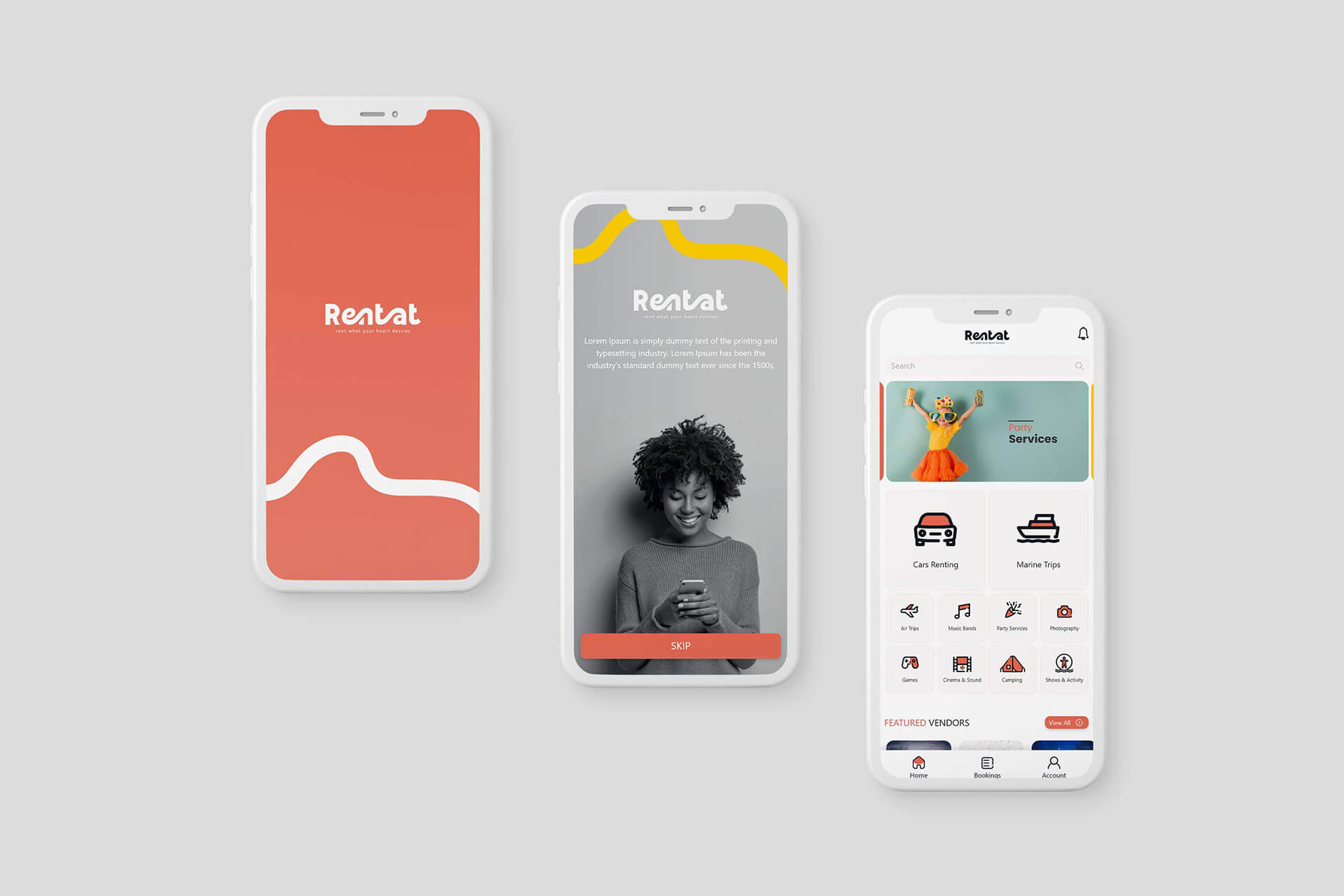
RentAt is a versatile mobile application designed to revolutionize the rental experience, offering users a convenient platform to access a wide array of rental services. From cars and marine trips to party services and photography, RentAt caters to diverse rental needs, providing a seamless and intuitive user experience.
Visual Identity:
The brand colors of #e16855, #fff, and #f3c801 are utilized to create a vibrant and inviting interface.
Consistent use of colors throughout the app enhances brand recognition and establishes a cohesive visual identity.
User Interface:
The interface is designed to provide clear hierarchies, with rental categories prominently displayed for easy access.
Visual elements such as icons and typography are carefully chosen to ensure readability and user comprehension.
Category Prioritization:
Given the diverse range of rental options available, categories are prioritized to prevent user confusion.
High-traffic categories are featured prominently on the homepage, with the option to explore additional categories through a menu or search function.
Icon Design:
Custom icons are created to represent each rental category, ensuring visual consistency and aiding in quick category identification.
Navigation icons and other app requirements, such as search and account sections, are designed to complement the overall aesthetic of the app.
User Experience:
The user experience is optimized for efficiency and simplicity, with intuitive navigation and streamlined booking processes.
Clear call-to-action buttons guide users through each step of the rental process, from browsing to booking.
Conclusion:
Rentat revolutionizes the rental experience by providing users with a comprehensive platform to access a wide range of items and services for rent. Through a user-centric design approach, Rentat ensures that users can easily navigate through the app, discover rental options, and complete bookings seamlessly.


